
Our good friend Juan González from Sistrix has taken a look at the winners and losers of Google’s 2015 mobile friendly update.
Last week’s Mobile World Congress in Barcelona had the dawning of AMP (Accelerated Mobile Pages) firmly on the agenda, and this coupled with the following evaluation of 200 domains, really hits home that one of the largest mistakes you can make is not having a mobile friendly website.
Take for an example The British Monarchy. Royal.gov.uk does not offer a mobile-friendly version of its site, which means its mobile-visibility is 37% lower than their desktop counterpart.
When Sistrix looked at the amount of keywords they rank for, there were 50% fewer mobile keywords (1,063 mobile keywords vs 2,054 desktop keywords). This means that for those 991 mobile keywords some other domain will have taken the place of Royal.gov.uk for a smartphone search on Google.
Here are some more winners and losers…
Winners
1) Twitter.com
The beleaguered social network actually had the largest gain in mobile visibility. Twitter.com ranks for 211,660 keywords for a desktop search and 272,368 keywords for mobile searches. A huge difference of nearly 60,000 keywords, (28%).
Twitter ranks for 78% more top 10 keywords on mobile than on desktop-searches.

Clearly partnering with Google and allowing its tweets to be indexed has led to this triumph.
2) Msdmanuals.com
The domain for Merck, the healthcare manual provider, has roughly the same number of mobile and desktop keywords (12,393 vs. 11,600), with a slight edge of 6,5% for the mobile keywords.
If you only look at the keywords within the top 10 search results, the mobile version ranks for 1.110 keywords while the desktop version only ranks for 744 keywords, an increase of nearly 50% between the mobile and desktop top 10.
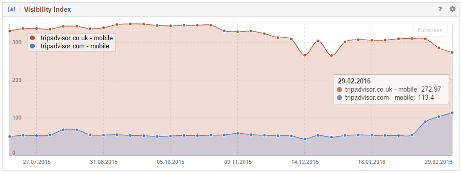
3) Tripadvisor.com
Tripadvisor. (Read more...) managed to gain 17.26% in their mobile visibility, which is a lot for a domain of its size, though they might want to check if this increase is not hurting Tripadvisor.co.uk as the following chart suggests.
Losers
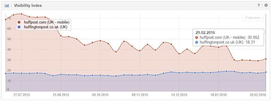
1) Huffingtonpost.co.uk
Huffpo lost 87.24% of its mobile visibility on Google.co.uk. The reason for this decrease is the simple fact that the mobile version of Huffingtonpost.co.uk is hosted on the domain Huffpost.com.
If we compare the desktop version of Huffingtonpost.co.uk, with the mobile version of Huffpost.com, we see that mobile visibility is 70% larger than the desktop counterpart.
2) Etymoline.com
The online etymology dictionary managed to lose 50% of its keyword rankings between desktop and mobile searches. The loss in the top 10 is even more pronounced (70%) because it simply doesn’t have a mobile version.
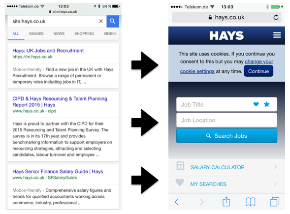
3) Mousebreaker.com (and 17 Hays.co.uk)
If a specific page is not available it should return a status code 404 (page not found) instead of just redirecting the user to the home page, regardless of the desktop or mobile version. All these redirects to the home page constitute soft-404 errors which have a negative impact on the site.
Mousebreaker.com (-67%), for example, redirects many of its pages which are not optimized for mobile use – because many of their products use Adobe Flash – to their mobile home page.
For instance: http://www.mousebreaker.com/games/bookworm/playgame redirects to m.mousebreaker.com when accessed with a smartphone, instead of returning a 404, as it should.
Another example is Hays.co.uk (-46%), which only has a homepage that’s mobile optimised. Every URL is therefore redirected here when accessed from search on a smartphone.
And here’s a final example of where domains can really mess up, from further down the chart…
46) Monarch.co.uk
Google has stated it won’t tolerate the use of full-screen mobile app ad interstitials and it’s clear from Monarch.co.uk that this is ringing true. Monarch has lost 36,40% of its visibility thanks to its use of interstitials.
For a complete list of the top 30 winners and losers visit the original post at Sistrix.
Related reading

The web is becoming more and more visual, and nowhere more so than on social media, where some of the most influential ... read more

Google has announced the launch of a new feature, which allows presidential candidates to post directly into search results. It allows the ... read more

A blog can still take you to the top. If you do it right. Everyone loves free information. And free information reels ... read more

Concerns about mobile ad-blocking have only accelerated since Apple’s latest iOS version began allowing the technologies. More recently, Samsung smartphones also began ... read more
This entry passed through the Full-Text RSS service - if this is your content and you're reading it on someone else's site, please read the FAQ at fivefilters.org/content-only/faq.php#publishers.