Attracting clicks on your ads is just the first part. A great landing page is essential to any PPC strategy.
You then need to ensure that the landing page meets customer expectations and works as hard as it can to transform clicks into conversions.
The ability to deliver relevance to searchers and convert also has an impact on Google’s Quality Score which in turn impacts AdRank and bidding costs, ad positions, and eligibility for certain ad extensions.
Naturally Google doesn’t tell you exactly how AdRank and Quality Score work, but the general principle of delivering a quality ad should optimize landing page performance while satisfying Google’s aims.
The aim of landing pages
Typical objectives include:
- Converting clicks into sales or registrations by either making an immediate sale or generating leads for future sales, such as details for a quote, test drive, and so on.
- Collecting customer data to build up an email list or to obtain data for more effective marketing.
The majority of landing page visitors are unlikely to convert so secondary objectives such as explaining the company’s products or services, and generally raising awareness, should be taken into account.
1. Which type of landing page should you use?
There are two kinds of landing pages – bespoke landing pages and those that are integrated into the main website, and there are pros and cons.
Integrated landing pages are more efficient because the pages are created as part of the site’s design.
They are also more effective from an SEO perspective as they are a permanent part of the website.
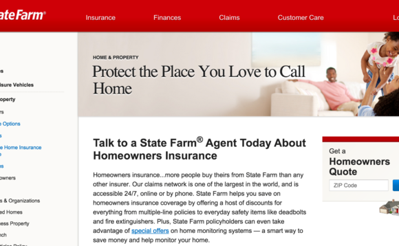
One drawback is that they are less focused on the conversion goal and therefore have more of a struggle meeting the objectives than bespoke landing pages. For example, this page from State Farm is integrated into the (Read more...) of the site but it isn’t as focused as a “pure” landing page.
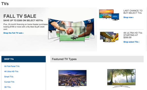
However, pages integrated into a site can be more appropriate for some general queries. Users searching for “TVs” or “digital cameras” may find a category page (like this from Best Buy) more useful than a focused landing page.
Bespoke landing pages are created specifically for the campaign in question. The benefit of these pages is that they are stripped down and more tightly focused on the conversion.
This format makes them more likely to deliver results, though there are some drawbacks. Bespoke landing pages require more effort and resources to create and maintain.
They also have SEO issues – since these pages are often not integrated into the site, they do not benefit from the main site’s search authority.
A possible solution would be a hybrid of the two approaches – an optimized version of existing pages for a particular campaign, or using the homepage as the landing page and adapting the messaging.
2. Make landing pages relevant to the ad
People clicking on PPC ads are more likely to have a strong purchase intent compared to general browsers, and the landing page needs to meet their expectations.
If a consumer clicks on an ad for iPhone 6, they need to see text and images that matches the query, details of prices, and how to buy one.
Users will make a quick decision to stay or leave a page, and relevance to the PPC ad will reduce bounce rates and send the right signals to Google.
3. Use graphics and imagery wisely
The graphics and images you use can have a big impact on conversions, so choose wisely.
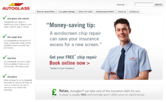
This is an area to test because different imagery can make a big difference. Here’s a great example illustrating this point from CRO expert Craig Sullivan – see the Slideshare here.
Here’s the “control” image for the Autoglass landing page.
And this version improved conversions by 12.5 percent.
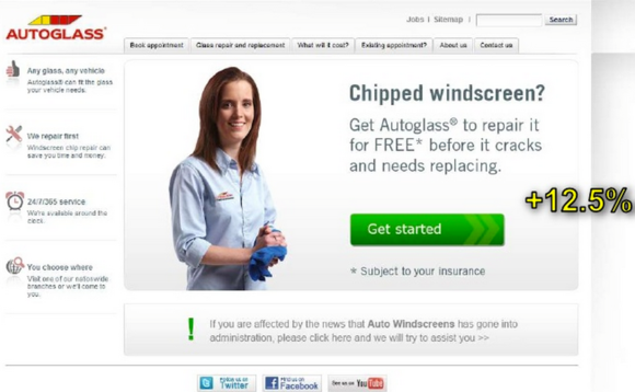
As the rest of the slides show, different variations for different markets also had significant effects on performance.
4. Consider removing navigation options
Removing the navigation options should eliminate distractions for the user and increase the chances that they will complete a purchase or fill out a form.
However, this also leaves users who don’t take these actions at a dead-end, unable to browse to other areas of the site.
A compromise solution would be reducing the number of navigation options available. This removes most of the potential distractions, while still leaving paths to the rest of the site.
5. Provide continuity from ad to landing page
It’s simple enough, but a lot of sites get this wrong. Having clicked on the ad, the language and imagery on the landing page should tie in with the ad. One simple way to achieve this is to use the same language on both.
For example, this PPC ad uses the phrase “car rental in Los Angeles.”
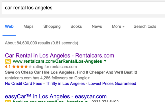
The landing page uses the exact same text which instantly reassures the visitor that they’re on the right page.
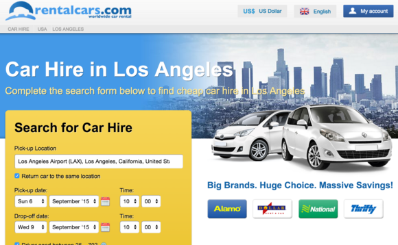
This impression is reinforced by making the search box default to LA, which also saves time for users.
6. What to do with old landing pages
Landing pages are often used for short-term campaigns, and consideration needs to be given to what happens to the page after the campaign has finished.
Using a custom 404 error page or a 301 permanent redirect is one way to manage this issue, as it avoids having customers viewing out of date offers.
7. Provide options for people who don’t buy or sign up
Not everyone will buy or sign-up from your painstakingly created landing pages, so provide options for those that don’t.
For those who may have other questions about the product or service, or that simply prefer to talk to someone, adding prominent phone numbers or live-chat options can work well.
For others, offering email sign-up options for updates or providing a path to other areas of the site can help to keep people interested.
8. Throw in some social proof
Social proof in the form of reviews, recommendations, and testimonials, works well online, so use it on landing pages.
Well-known trustmarks and security logos can also help here. This will reinforce the credibility of the brand and site.
Here’s a good example from UDC Bike Rental, which invites users to read reviews on third-party sites, as well as to check out their social channels.

Booking.com takes in further with this landing page for the term “New York hotels.”
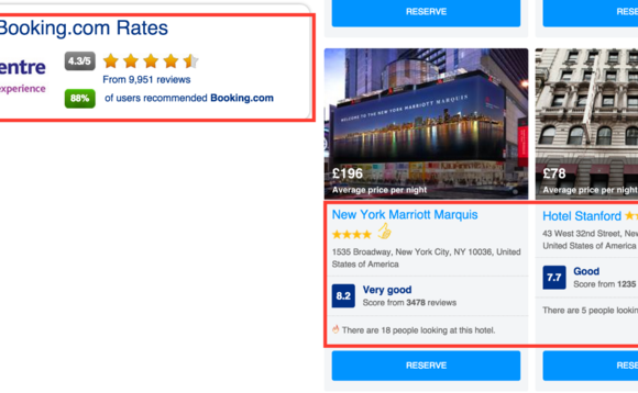 There are reviews for the website, a display of well-reviewed NY hotels, and the text showing how many people are looking at that hotel right now.
9. Experiment with page length
There has been plenty of debate about this and there’s no right or wrong answer here. The short answer is, as Neil Patel says here, “It depends.”
The length needs to be long enough to sell the product or service in the way you want to, but not so long that it deters visitors.
Perhaps a more detailed page works with more complex products and services. For instance, Apple’s landing pages for iPads and MacBooks are long with lots of imagery to help sell the product, and space is required to present the technical detail.
However, if you’re selling paper clips there’s no need to give it too much space. The key is to try variations and see what works best.
10. Provide enough detail to help visitors decide
This is related to the previous point. The level of detail required will generally depend on the product.
This is not always the case, as this example from Bellroy shows.

It’s a very long landing page for a wallet, which may seem like a simple purchase. However, it works well as the page is uncluttered and very easy to scan.
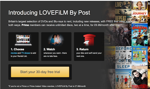
11. Clear calls to action
What constitutes a good call to action is a cause for some debate, and there are many different ways to achieve the goal. CTAs should be tested to find the best performing version.
Some points to consider:
- Ease of finding it. If users have to search for the call to action, it isn’t doing its job.
- Color. There’s no right or wrong answer here, but the color should help to make the CTA stand out.
- Position on the page. Place it where people can see it, or place multiple CTAs to make sure people see them on long landing pages.
- Size. It should be big enough to stand out.
- Wording. The wording should communicate the action you want users to take.
12. Make it mobile friendly
With mobile accounting for 30 percent of all U.S. e-commerce sales, it’s imperative that landing pages are optimized for mobile.
Presenting mobile visitors with a desktop page is guaranteed to increase bounce rates. A good user experience is key and features such as click-to-call should be considered for mobile landing pages.
There’s also a strong case for stripping down the landing pages by removing any unnecessary features to reduce the page weight.
Booking.com’s mobile landing page is very different to the desktop version shown earlier in this article.
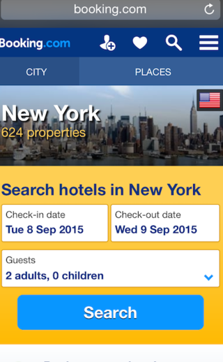
It cuts straight to the chase with a simple search option.
13. Make sure it’s quick
Landing pages need to load quickly for two reasons. First, because users will become frustrated with slow loading pages and may leave before it finishes loading. Second, Google also takes page speed into account as part of its Quality Score.
14. Measure, experiment, and improve
Don’t rest on your laurels. Landing pages should be continually tested and improved to achieve the best results.
In summary
I’m primarily thinking about PPC landing pages when writing this article, but many of these principles apply equally well to other kinds of landing pages.
For example, if you’re running an email campaign, the page you send users to has to work in the same way. Even though some of the points here relate to Google’s Quality Score, the principles are sound.
Related reading
Sites which scrape and copy content from others are sometimes able to outrank the original source and damage their search rankings. What can be done about it?
What is a title tag and how do you write one? Why are they important? Do they actually help with SEO? Can I see ... read more
With the share of digital ad spend at 29.9% in 2015 and expected to increase to 39.3% in 2019* the digital advertising ... read more
Google’s dominance of the search market looks set to continue for the foreseeable future, but there are many who would like a real ... read more


